I think they (high taxonomic rank) should take their chance, there are already far too many in the Help Zone. High taxonomy is often used (I use it) to put difficult Observations into the Other Observations Carousel and it is often as far as we can go (just look at the Moths Pit) . Those who are specially interested in the taxa will (should) browse ‘at height’.
To be honest, if we were good at Programming, (by we I mean they). then obs should be auto-collected into projects like the Moth Pit, think of the endless fun you could have if unidentified trees (not as plants) or spiders were all in one place. Some of that would be solved if everyone used Tags more efficiently.
(Search) “you specify the geographic area.” would be in a Luxury List of Improvements. as yet we have not had a direct response from admin regarding even the burning Changes Tracker Issue.
BACK TO THE LIST
The identification drop-down list issue is rising up my personal list: just had difficulty with this one -
“Silver Y” -> “no matches”
“Silver” -> matching name, but quite a way down the list.
This must be hugely confusing for new users.
At times, everyone must be confused by the anomalies of the ‘Drop-Down’. I certainly am - search for ‘Panel Games’
To be frank (and boring) it is time that Admin realised how uncomfortable the whole site is and added a few sympathetic, perhaps promising comments.
There is good evidence that good people come here for a day or two and leave for ever. New users come, rarely get welcomed, and leave. There is so much wrong with iSpot. And yet…
I get so much frustrating satisfaction here…there really seems no point in adding to the list of difficulties.
BACK TO THE LIST THEN
Sorry to go on about it: but here -
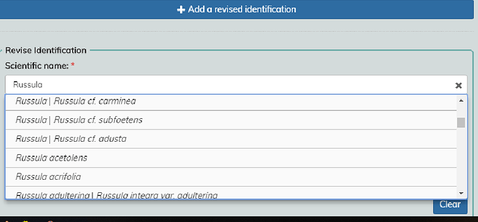
It seemed impossible to input a “starter” that would lead to the option of a genus-level identification.
I went there. It seemed an easy choice. I think you have offered this Genus before, though I could not find an example. The short vertical stroke | defines a boundary between what you can have and what’s considered a synonym or cf. https://en.wikipedia.org/wiki/Cf.
With russula it’s no more confusing than, for example, Lactarius cf.
BACK TO THE LIST THEN
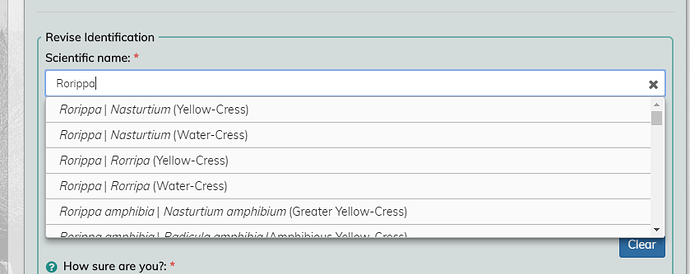
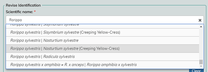
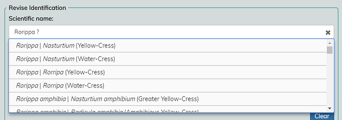
It took me several attempts to enter Rorippa recently. iSpot kept replacing the list of Rorippa species with a longer list where if Rorippa it was way down the bottom. (I got the impression that it wasn’t there at all.)
I don’t think this ‘issue’ has changed since ‘the beginning’.
Names given to the right of the vertical slash are extinct names, common names or accepted synonyms. Either way ONLY the name LEFT of the slash will appear in the Scientific name (you can DELETE the common name if it doesn’t apply)
But where you choose a species name, the common name (in Brackets) is carried to the Common Name Panel
You can try this - to Water Cress (but still safely delete the Common name) Substituting A Cress should be OK,
I really don’t think this has changed in years but lately the ID panels are more sensitive to (MY) ‘interference’.
…
Editted in
Take a moment to look at the SANBI Dropdown where several Common names’re available in different languages. Should the UK one have Gàidhlig, Gaeilge nah Eireann, Cymraeg version and perhaps regional ones too?

Please, please don’t say yes!!
SOME IMPROVEMENTS SOON PLEASE
a few people have suggested a Like:heart: or Thanks Button 
Whatja think?
…
The last reply to this topic was 241 days ago. Your reply will bump the topic to the top of its list and notify anyone previously involved in the conversation.
I don’t like LIKE, but I would like a THANKS button.
I think the Thanks button should, somehow, be applied to a user who adds a useful comment or ID. That would be hard to implement.
Thanking someone for a nice Observation, a jolly good show, or a moment of excellence, or a ton of expertise, MAY best be shown in a Comment within the Observation.
Speaking personally I would not like to see score of  ⑱ attached to some obs and not others.
Postscript
Added a few words to acknowledge Jo’s comment below!
You are right, we don’t want iSpot to be competative.
Maybe better to say a few words of thanks.
…
Edit: I’ve just found out about the Edit facility for Forum posts (thanks dejay) so I’m trying it out with this extra sentence.
You could put thanks up on the changes tracker; “X thanked you for your identification”, “X thanked you for your comment”.

If only the majority of users would use their Changes Tracker.
BROUGHT FORWARD
yet again and EDITED a year on…
OVER TWENTY IMPROVEMENTS needed to make the site much more pleasant to use.
In no special Order of importance then -
.
1 Improve Track Changes
REMOVE our own entries from CHANGES TRACKER, which are duplicated in ACTIVITY TRACKER. Only display the last change to the same Observation (if there are several)
1a Retain ‘Unread’ (currently yellow) marker
until the specific post has been visited
2 Allow Edit of Comments
until locked by Reply
3 Refresh the Home Page
Add a running Welcome banner which changes when ‘things’ are not right. Add strong links to RECENT OBS and START HERE (New Pages?). Tidy up and remove stale notices. Add a large Picture of the Month (NOT competitive?).
4 Update all Help Pages
create an Index
5 Rationalise Global
currently, it means two things in iSpot, ALL Communities or those not UK.
EXCLUDE Other named Communities from GLOBAL or include them all - make it plain which
REVISE the Boundary between the UK&I and near Europe.
CREATE a third Carousel on the Home Page Recent Global Observations
6 Retain Locations somehow
allow users to creature their own Index (Home, Mill, Foxton Wood, etc) thus saving the laborious need to enter location details every single time.
7 Allow HTML Text
to be retained in descriptions (projects mostly) through Edits. Allow restricted HTML text in comments and Ob. descriptions, but particularly <a ref and so avoid terribly, sometimes over-spillingly long, URLs
8 Improve Search
allow a specific search for Observations (find all Obs (only) of Phytolacca acinosa for example) And for precise occurrences like “gooseneck”. Make a search unique to the selected Community
9 Update dictionaries
this is imperative as we observe more and more rare varieties and the Dictionaries get more and more OUT-DATED
10 Bring back Social Points
shows those who engage with users or the system or add agreements to be seen as ‘valuable’ as those with high Score Icons
11 Sort Enlarge Picture
remove Zoom? Allow Cycling through Observation pictures when enlarged
12 Next & Previous buttons
bring back Next and Previous clicks when browsing Carousels or Filters
13 Fix the Reputations algorithm
Where sometimes the score rating is FAR from logical and in ERROR - may apply mostly to Experts and Knowledgeables
14 Modify quizzes
REMOVE, test, revise and replace the Quizzes
15 Allow Pages search
in Project Gallery view - ;‘Go to Page 9’, say. Some Project Galleries have over 40 pages, requiring over 40 refreshes to get to the FIRST occurrences. The same applies to the map, we have to click Show More Observations as many times as there are ‘thousands’ to get the final number of Obs. The Changes & Activity Trackers already have this feature. [your-ispot/activity-changes page=6]
16 Allow us to Follow
(and UNfollow), a user
17 Allow PREVIEW
of Observation detail before ‘publishing’
18 Devise ways to capture & nurture newcomers
linked to Items 3 and 16 (above)
19 Review the way Changes links take us to Comments
so that the link takes us TO the comment.
Perhaps Colour the relevant Panel in the old way.
20 Add a more powerful banner
to the Home & Upload Page PLEASE CHECK YOUR CHANGES TRACKER FREQUENTLY : also HERE https://www.ispotnature.org/communities/uk-and-ireland/view/article/566/ispot-help-and-support
21 Disallow Refresh
for some operations (or modify to return to Previous page, NOT the beginning) after an agreement is added, specially during next and previous process. SPEED UP refresh anyway
22 Add-to-Project Button
Like Add to Favourites, Follow/UnFollow user, this would be a really useful too
23
suggestions for additions please?
We have been asking for MONTHS (actually for years) for a more dynamic Home page, with promotions for Projects, Observations, the Forum and up-to-date iSpot news.
With a Photo of the week and stuff that CHANGES regularly. Out with stale material, in with an Admin page away from the Home one, dump things that are mostly irrelevant to smooth running and IN with new Ideas, more consultation and SOME ACTION.
Please? @Janice_A
Renewing the Requests Thread
the New Dictionary is taking all the energy and time that the Curator and Coder currently have.
But it should not stop us making suggestions for possible improvements
.So…
Continue allowing invalid IDs BUT FIX the bug that sometimes causes failures even though the dictionary Drop-down menu is used
Disallowing agreements to Invalid Panels- except in supportive comments
Colouring Invalid Panel RED
More active Curation with Failed ID Panels, helped by appointed but volunteer Taxa Monitors
More training of users to take more CARE over IDs
A decent INDEX on the home page of Community Help-Projects.
"The last reply to this topic was almost 2 years ago. Your reply will bump the topic to the top of its list and notify anyone previously involved in the conversation.
Are you sure you want to continue this old conversation?" Yes please
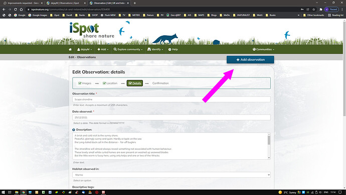
One thing that bugs me inordinately: the “Add Observation” button that persists through the adding of an observation. An incautious click obviates the whole process.
yes thanks, I thought perhaps I was the only one finding that a nuisance. Fortunately it does not DUMP the observation.
Here it is during an edit @miked
I will add these to a list early in the New Year
Odd: it did, for me, hence the comment. But maybe it is internet connection problems (well, we are nearly 90 miles from London, positively provincial…)
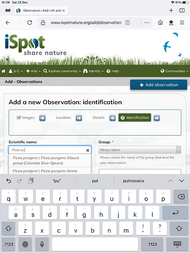
Here’s an odd thing.
In adding an observation, I usually start by checking the Identification drop-down list.
Picture 1 shows Picea pungens/ Colorado spruce is an option.
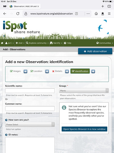
When I add an image and return to the Identification it is blank. Picture 2. That’s not usually a problem, as I can enter it again.
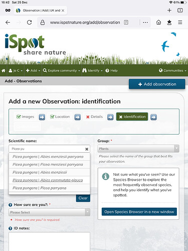
Picture 3. However, the options shown are not the same.
I wonder why that is…

